In today’s competitive market, how bottle design affects brand perception has become a critical consideration for companies. The bottle is often the first interaction a consumer has with a product. Its shape, color, and material can evoke various emotions and associations. This is why many brands invest significantly in creating innovative and distinct packaging.
Research shows that appealing bottle designs can enhance consumers' perceptions of quality and value. A sleek, modern design might suggest luxury, while a quirky, colorful bottle can evoke playfulness and creativity. These design choices can lead to deeper brand loyalty and increased sales. However, companies face the challenge of balancing creativity with functionality. A well-designed bottle must not only attract attention but also serve its purpose effectively.
Yet, the impact of design is not universally positive. Overly complicated or extravagant packaging can confuse consumers or seem disingenuous. Brands should reflect on the message their bottle design communicates. Ultimately, understanding how bottle design affects brand perception is essential for brands aiming for long-term success in a global market.
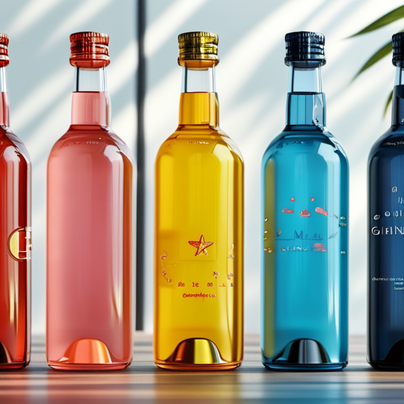
The shape of a bottle plays a crucial role in how consumers perceive a brand. A unique silhouette can evoke feelings of luxury or playfulness. For instance, a sleek, tall design often suggests elegance and sophistication. In contrast, a round, chunky bottle may be perceived as friendly and approachable. These associations stem from years of market research and consumer psychology.
When shoppers face various options, they rely heavily on visual cues. The bottle's shape can trigger past experiences or memories. This makes it easier for consumers to recognize and recall a brand. A recent study found that people remember brands with distinctive bottle shapes much better than generic designs. However, not all designs resonate positively. Some forms may confuse or frustrate consumers, ultimately harming brand loyalty.
Considering cultural differences is also vital. In some regions, specific shapes may hold symbolic meanings. Brands must navigate this landscape carefully. An initial design may receive acclaim, but evolving consumer tastes could demand change. Thus, continuous feedback is essential. Observing how shape impacts perception enables brands to tailor their approach effectively.
Bottle design significantly impacts how consumers view a brand. Among the elements of design, color plays a vital role. Color psychology suggests that different hues evoke specific emotions and perceptions. For instance, red can create feelings of excitement, while blue often conveys trust. This is crucial for brands seeking to establish an emotional connection with their audience.
Tips: Consider your target audience. Think about what colors resonate with them. A younger audience might respond well to vibrant colors, while a more mature demographic might prefer subtle tones. Test different color bottles to see which ones drive engagement.
Moreover, consumers often make quick judgments based on color alone. Research indicates that color increases brand recognition by up to 80%. However, brands must be careful. A mismatch between bottle color and product can lead to confusion. Remember, the context of the color is essential. Reflect on the message you want to convey.
Tips: Gather feedback on your bottle colors before launch. Use surveys or focus groups to learn how potential customers feel. Adjust your designs based on this data. Understanding your audience's preferences can guide your decisions and enhance brand perception globally.
| Bottle Color | Psychological Effect | Brand Perception | Market Impact (%) |
|---|---|---|---|
| Red | Excitement, energy | Increased impulse buys | 30% |
| Blue | Trust, dependability | Preference for quality | 25% |
| Green | Health, tranquility | Eco-friendly perceptions | 20% |
| Yellow | Happiness, optimism | Attention-grabbing | 15% |
| Black | Luxury, sophistication | Premium appeal | 10% |
The material of a bottle significantly shapes sustainability perceptions. Research by the Container Recycling Institute indicates that 70% of consumers prefer products in recyclable packaging. Materials like glass and metal are viewed as more environmentally friendly than plastic. This preference influences purchasing decisions.
Reports show that brands using sustainable materials can see a 20% increase in sales. Biodegradable or recyclable materials foster trust. Consumers often associate these materials with a company’s commitment to sustainability. However, perceptions vary across regions. In some areas, plastic packaging still holds sway, despite environmental concerns.
Confusion arises regarding recyclable labels. Not all plastics are recyclable, which can mislead consumers. Transparency in material sourcing is essential. Consumers seek brands that educate them about their packaging choices. This need for clarity presents an opportunity for brands to engage more effectively.
Labeling and typography play a critical role in shaping brand identity. These elements are often the first point of contact between consumers and a brand.
Research shows that 70% of consumers judge a product by its label alone. This decision can happen in less than a second. Effective labeling captures attention, conveys information, and builds an emotional connection.
The choice of typography impacts readability and brand perception. A report by the Design Council indicates that 73% of consumers prefer brands that use easy-to-read fonts. This preference highlights the need for clarity over complexity. Brands can misstep by prioritizing style over substance. If a label is hard to read, it can diminish consumer trust. Consumers might question what else is unclear.
Designers should also consider cultural implications. Colors and symbols can have different meanings across regions. For instance, red may signify luck in some cultures while it symbolizes danger in others. Brands need to ensure that their labels resonate with local audiences. A disconnect can lead to confusion or alienation. Understanding these nuances is vital for global success.
Bottle design plays a crucial role in shaping brand perception across various cultures. Research indicates that 79% of consumers base their first impression of a product on its packaging. This statistic highlights the significance of aesthetic appeal in influencing purchasing decisions. Different cultures prioritize distinct elements in bottle design. For instance, minimalistic designs often resonate in Western markets, while vibrant colors and intricate patterns attract attention in Asian countries.
Cultural symbolism impacts consumer preferences significantly. In Japan, for example, sleek and modern designs are preferred, reflecting the culture’s appreciation for simplicity and innovation. In contrast, Latin American consumers might gravitate towards bold designs that reflect their vibrant cultural heritage. According to a report by Nielsen, 58% of consumers feel more connected to brands that understand their cultural identity. This shows the importance of culturally relevant bottle designs in establishing consumer trust.
However, companies must navigate the potential pitfalls in these variations. Misinterpretations can lead to negative perceptions. A design that works well in one market might not translate effectively to another. It is crucial for brands to conduct thorough market research. Understanding local preferences can prevent costly blunders. Ultimately, a thoughtful bottle design strategy can bridge cultural divides and enhance brand loyalty.
: Bottle shape affects brand feelings, evoking elegance or playfulness. A tall design suggests sophistication, while round shapes feel friendly.
Unique shapes enhance brand recall. Consumers remember distinct designs better than generic ones, aiding recognition in crowded markets.
Yes, confusing or frustrating designs can harm loyalty. Not every unique shape resonates; it must align with consumer expectations.
Color greatly influences emotions. Different hues evoke varied feelings. For instance, red signifies excitement, while blue reflects trust.
Younger audiences may prefer vibrant colors, while older demographics often favor subtle tones. Tailoring colors to the target is essential.
A color mismatch can confuse consumers. The context of color is important for conveying the right brand message.
Collect feedback through surveys or focus groups. This helps brands understand preferences and refine their designs effectively.
Certain shapes may carry specific meanings in different cultures. Brands should adapt designs thoughtfully to avoid misinterpretations.
Consumer preferences change over time. Ongoing feedback helps brands adapt and stay relevant in a dynamic market.
Understanding audience preferences and cultural symbols is key. Thoughtful designs can improve recognition and emotional connection worldwide.
Bottle design plays a crucial role in shaping brand perception across the globe. The shape of a bottle can significantly influence consumer associations and recognizability, with distinct forms evoking specific emotions and linking them to brand identity. The psychology of color also affects brand perception, as different hues convey various attributes and can attract or deter consumers based on cultural and contextual factors. Additionally, the choice of bottle material impacts sustainability perception, with eco-friendly materials enhancing brand image in environmentally-conscious markets.
Labeling and typography further act as silent communicators of brand identity, encapsulating a brand's values and appeal through visual language. Moreover, cultural variations highlight the complex ways bottle design resonates differently across diverse markets, with regional preferences influencing consumer sentiments. Ultimately, understanding how bottle design affects brand perception is essential for brands aiming to establish a strong global presence and connection with consumers.

Swapora Bottle