Choosing the right bottle color can significantly impact your brand's identity. The color of a bottle does more than just attract attention; it conveys emotions and messages. When you think about how to select bottle color for branding, consider your target audience. Colors evoke different feelings and associations. For example, blue is often linked to trust, while red can signify passion and excitement.
In the crowded market, standing out is essential. A unique bottle color can differentiate your product from competitors. However, it’s crucial to balance creativity with relevance. A color that appeals to you may not resonate with your audience. Test ideas before making a final decision.
Moreover, reflect on your brand story. Your bottle color should align with your overall message. Be mindful of cultural interpretations of colors. What works in one market may not in another. It’s not just about aesthetics; it’s about building a connection. Remember, the right bottle color can elevate your brand, but choosing poorly might confuse potential customers.
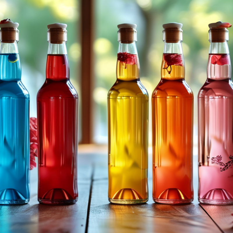
The color of a bottle carries significant psychological weight. Consumers often make split-second judgments based on color alone. For instance, bright colors like red can evoke feelings of excitement and urgency. They often grab attention quickly, especially in a crowded marketplace. In contrast, blue is often associated with trust and reliability. It can encourage consumers to linger longer and contemplate a purchase.
Yet, choosing the right color isn’t straightforward. Not all consumers react the same way. Cultural differences influence perceptions of color. For example, white symbolizes purity in many Western cultures, while it can represent mourning in some Eastern cultures. Brands must consider their target audience deeply. Testing various colors within a specific market can yield insights that statistics alone cannot provide.
It’s also essential to reflect on the emotional narrative behind a color. Do consumers genuinely connect with a color, or does it merely serve as background noise? Missteps can occur when brands assume their choices resonate universally. Therefore, ongoing feedback from consumers can be invaluable. Ultimately, the right bottle color can elevate a brand’s identity, but it requires thoughtful analysis and a willingness to adapt.
Color psychology plays a crucial role in branding. The right bottle color can enhance recognition and reinforce brand identity. Consumers often make snap judgments based on colors. A vibrant hue may evoke excitement, while a soft shade may suggest calmness. Brands must choose wisely to connect with their target audience.
Consider how colors relate to emotions. Red can symbolize energy. Blue often conveys trust. Green is associated with nature. These associations are not universal but can be powerful. A mismatch between a color and a brand's message can lead to confusion. Sometimes, brands ignore these subtleties, resulting in lost opportunities.
It’s worth reflecting on how colors interact with societal trends. For instance, eco-conscious brands may benefit from earthy tones. However, using popular colors without a clear strategy can dilute a brand’s uniqueness. Consistency is essential, yet flexibility is also a virtue. Brands need to adapt while staying true to their core identity. Color choices are not just aesthetic decisions; they are pivotal to brand perception and loyalty.
Bottle color significantly influences how consumers perceive product quality. Studies show that color affects visual cues and brand messaging. For instance, a 2021 report by the Color Marketing Group revealed that 85% of consumers base their purchasing decisions on color. The right color can enhance brand recognition and immediate emotional responses.
Psychological studies indicate specific colors evoke distinct feelings. Blue, often associated with trust, can encourage purchases in products like beverages. Conversely, red may stimulate excitement and urgency. In the beverage industry, a 2019 survey found that brands using green packaging experienced a 20% increase in perceived quality. Consumers often link green to health and sustainability.
However, relying solely on color can backfire. Analysis shows that not all shades resonate positively. For example, a darker shade may imply maturity, which might limit younger audiences. Similarly, unusual colors can create confusion. Brands should frequently test consumer reactions. Adjustments may be necessary. Monitoring helps ensure the message aligns with target demographics.
Color plays a crucial role in branding. It influences customer perception and emotional responses. Different colors evoke distinct feelings and associations. For example, red can signal excitement or urgency. Meanwhile, blue often conveys trust and calmness. These emotions can significantly impact buying decisions.
One fascinating case revolves around beverage companies. A brand chose vibrant green for their bottle. This decision reflected their commitment to sustainability and health. Green evokes freshness and eco-friendliness. Consumers felt drawn to this message. Sales surged, showcasing the power of color alignment with brand values.
In another instance, a luxury perfume brand opted for deep black. This choice emphasized elegance and mystery. The sleek appearance captured attention and reinforced a sense of exclusivity. However, the brand faced challenges. Some consumers felt the design was too stark. This feedback highlighted the need for balance in color choices. Understanding audience perception is essential for aligning the right colors with identity.
| Brand Category | Bottle Color | Consumer Perception | Sales Impact (%) |
|---|---|---|---|
| Beverage | Green | Natural, Refreshing | 15 |
| Cosmetics | Pink | Feminine, Soft | 20 |
| Food | Red | Appetite, Energy | 30 |
| Technology | Black | Sleek, Modern | 25 |
| Alcoholic Beverages | Brown | Rich, Premium | 10 |
Choosing the right bottle color is crucial for brand identity. Colors evoke emotions and influence consumer behavior. When selecting a color scheme, one must consider what the brand stands for. Each color sends a different message. For instance, blue often suggests trust and reliability. Green may convey health and eco-friendliness.
Understanding your target audience is essential here. Conduct research to see how different colors resonate with them. Color psychology plays a significant role. Certain colors may attract your audience better than others. However, not every color fits every brand. It’s important to reflect on whether the chosen color aligns with your brand’s values.
While it’s easy to lean towards popular colors, sometimes you must challenge that instinct. A unique color can differentiate your brand in a saturated market. Experimenting with shades and combinations may lead to unexpected results. Keep your message clear while being bold. A well-thought-out color choice can make all the difference in conveying your brand’s essence.
: Bottle color significantly influences consumer judgments. Bright colors evoke excitement, while subdued shades suggest calmness.
People have different cultural associations with colors. Brands need to understand their audience's perceptions deeply.
Testing various colors within specific markets can reveal valuable insights. Feedback from consumers is crucial for improvement.
Colors signal different emotions. Red suggests energy, blue conveys trust, and green relates to nature.
Yes, mismatched colors can confuse consumers. Brands must carefully align color with their messages to avoid issues.
Color choices should reflect societal trends. Eco-conscious brands, for instance, may benefit from earthy tones.
Consistency is essential, but flexibility is also needed. Brands should adapt without losing their core identity.
Consumer feedback may highlight discomfort with color choices. Balancing appeal and brand identity is a continuous challenge.
A beverage brand used green for its eco-friendly message, resulting in increased sales. Color alignment matters.
It helps brands understand perceptions and connections with colors. Regular feedback can guide adjustments for better alignment.
Choosing the right bottle color is crucial for branding as it taps into the psychological impact colors have on consumers. Different colors evoke distinct emotions and associations, influencing how a product is perceived. By understanding the psychological effects of various colors, brands can create a strong identity and enhance recognition in a competitive market. Furthermore, the bottle color can significantly affect the perceived quality and desirability of the product.
When learning how to select bottle color for branding, businesses should consider their brand values and messages they wish to convey. Utilizing best practices, such as analyzing successful case studies, can provide insights into effective color schemes that resonate with target audiences. Ultimately, thoughtful color choices can strengthen consumer connections and drive brand loyalty.
Swapora Bottle