How to Create a Luxury Look for Liquor Packaging in 2026?

Time:2026-11-19 Author:Oliver
0%

In 2026, luxury liquor packaging is less about adding gold and more about making every choice feel deliberate. A bottle should signal quality before it is opened, yet remain easy to hold, pour, store, and recognize. Strong designs connect the spirit’s character with clear typography, balanced proportions, and materials that feel considered rather than merely expensive. Details matter.

For teams exploring how to create a luxury look for liquor packaging, the starting point is a specific brand story. Build from a real production brief. Choose glass weight, closure, label stock, and finishing techniques for reasons customers can see and feel. A deep ink-blue label, a restrained foil line, or a finely embossed mark can create presence without visual clutter. Less can feel richer. But premium cues are not universal; an ornate finish may suit one audience and feel dated to another. Prototype under retail lighting, test legibility at arm’s length, and check how the package handles shipping and repeated use. Confirm that claims, warnings, and required information meet the rules in each intended market. Sustainability also deserves evidence: explain material choices accurately, and avoid vague environmental promises. Not every experiment works. That is useful. This guide examines design, materials, finishing, and practical checks. The goal is a bottle that feels distinctive, credible, usable, and true to its brand.
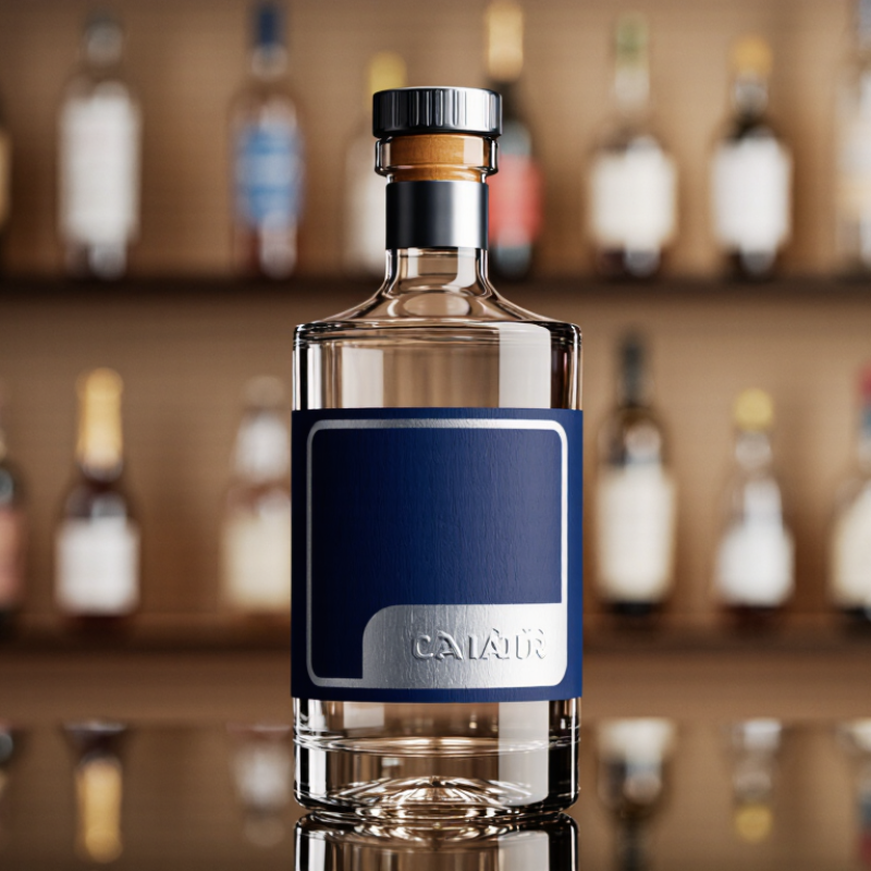
How to Create a Luxury Look for Liquor Packaging in 2026?

Define the Brand Positioning and Target Audience

Luxury liquor packaging in 2026 should start with a precise audience, not a gold finish. Is the bottle meant for a considered gift, a home bar, or a restaurant shelf? Each setting changes what “premium” needs to communicate. A gift buyer may value a substantial box and a clear story; a design-minded collector may notice the glass weight, closure, and label texture. Choose one primary audience, then test whether the package feels credible in their hands. A little restraint helps. Too many luxury cues can make a bottle feel generic.

Use research to sharpen that choice. PwC’s 2024 Voice of the Consumer Survey, covering 20,000 consumers across 31 territories, found that 46% were buying more sustainable products. Respondents were willing to pay an average 9.7% more for sustainably produced or sourced goods.

That does not prove every premium buyer wants recycled paper. It does suggest that material choices and sourcing claims can shape perceived value. Be specific: name the paper texture, show the closure, and explain a verified material choice in plain language. Avoid vague green claims. One detail can feel more convincing than a crowded box. And the first audience definition may be wrong; prototype with real buyers before committing to a costly finish.

Select Premium Materials and Sustainable Packaging Formats

A luxury liquor pack should feel deliberate before it feels expensive. Start with a well-finished glass bottle, a restrained label, and a closure that turns smoothly in the hand. Recycled glass can support a premium look, but color variation and supply consistency need checking with the converter. The International Aluminium Institute reports that recycling aluminium uses about 95% less energy than producing primary aluminium, making a recycled-aluminium cap or gift-case detail a useful material choice. Small details matter. Specify verified recycled content, and test the finish under shelf lighting; a dark coating can hide the material rather than celebrate it.

Reusable formats can add value when customers have a practical return route. The Ellen MacArthur Foundation’s 2023 report estimates that returnable packaging could cut greenhouse-gas emissions by 35–70% across six packaging applications, provided systems are designed well and scaled. That is not a guaranteed saving for every bottle. Transport distance, washing, and return rates change the result. A refillable bottle with a durable shape and a simple paperboard sleeve may work better than a heavy decorative box. I would still question whether every premium pack needs a second layer. A little restraint can feel more luxurious, and it often leaves less material to recover.

Develop the Bottle Shape, Label, and Visual Identity

A luxury bottle begins with a shape that feels deliberate in the hand. A broad shoulder, gently weighted base, and clean glass profile can suggest quality without excessive decoration. Test prototypes with damp hands and under warm shelf lighting; reflections can obscure small details. Keep the silhouette distinctive, yet comfortable to hold and easy to pour. Small details matter.

Develop the label around the bottle, not as an afterthought. Check how its edges meet the glass and whether the lettering stays clear across curved surfaces. Textured paper, restrained embossing, or a subtle metallic accent can add depth, but each finish should earn its place. Keep required product information readable in the markets where the packaging will appear. Less can feel richer.

A coherent visual identity ties the shape, label, cap, and color palette together. Use a small number of type styles and repeat visual cues consistently, so the design feels intentional from a distance and up close. Review printed samples beside the finished bottle; screen previews often miss color shifts and glare. Not every premium cue works. Heavy glass may feel substantial, but it also adds material, so weigh appearance against practical impact before final approval.

Apply Finishing Details and Practical Packaging Features

Luxury liquor packaging in 2026 should feel considered before it looks expensive. Use blind embossing for a quiet, tactile mark, then reserve metallic foil for one small area, such as a neck band or crest. A matte paper wrap can soften the shine of glass. Small details matter. Check that the foil stays clear under warm shop lighting; intricate lines can disappear.

Practicality is part of the finish. A fitted insert should stop the bottle from knocking against the box, while a thumb notch or fabric pull tab makes opening easier. Test the pack with damp hands and during a short drop test. A heavy box may feel impressive, but it can also add shipping weight and material. The balance is easy to miss.

Trivium Packaging’s 2024 Buying Green Report surveyed 9,000 consumers across nine countries and found that 82% were willing to pay more for sustainable packaging. The finding is not specific to liquor, but it signals why material choices matter. Choose recyclable components where feasible, and avoid combining layers that are difficult to separate. One honest imperfection: a restrained finish may look less dramatic in a product photo. In person, its texture can feel more convincing.

How to Create a Luxury Look for Liquor Packaging in 2026?

Finishing details and practical features can work together to elevate a bottle’s presentation.

This illustrative 1–5 design-planning scale is a qualitative guide, not consumer research. Pair tactile details such as embossing and foil with functional choices like secure closures, tamper evidence, and protective inserts.

Test Compliance, Durability, and Shelf Appeal

A luxury liquor package in 2026 has to do more than catch the eye. It must protect the bottle and present required information clearly. Check label dimensions, contrast, and type size against the rules for each intended market. Small lettering can disappear under warm store lighting. Test a printed sample, not just a digital proof. Keep space around key details.

Durability needs real handling. Place filled bottles in their intended cartons, then test for vibration, drops, moisture, and temperature changes. Look for scuffed foil, lifted labels, cracked corners, and loose closures. A soft-touch coating may feel elegant on a desk but mark easily in transit. That matters. Record the conditions and repeat any test that gives inconsistent results.

Shelf appeal deserves the same care. View the package from several feet away, beside products with similar shapes and colors. Check whether the silhouette, label hierarchy, and finish remain distinct under bright and dim lighting. Embossing or metallic accents can add depth, but too many finishes compete for attention. A sample may look rich and still feel fussy. Adjust one detail at a time, then ask people unfamiliar with the design what they notice first. Their answers may not match your intention, and that is useful evidence.

How to Create a Luxury Look for Liquor Packaging in 2026? - Test Compliance, Durability, and Shelf Appeal

Practical validation checklist for premium spirits packaging. Numerical acceptance criteria below are suggested project targets, not universal legal requirements.

Evaluation area Test or reference Suggested acceptance criteria Why it matters
Food-contact compliance Review every material that can contact the beverage, including bottle, closure liner, coatings, and inks where relevant. Check applicable market rules, such as EU Regulations (EC) No 1935/2004 and No 2023/2006, or applicable U.S. FDA requirements. Document material specifications, supplier declarations, and any required migration or suitability testing for the intended beverage, contact conditions, and sales market. Confirm requirements with a qualified compliance specialist. Decorative finishes do not replace component-level compliance checks; requirements depend on material and jurisdiction.
Glass pressure resistance ASTM C147, Standard Test Method for Internal Pressure Strength of Glass Containers. Set the minimum pressure requirement with the glass supplier based on bottle design, filling process, and product conditions; test samples from production-representative runs. Helps assess bottle suitability where internal pressure is a relevant risk. The required limit is package- and product-specific.
Glass thermal shock ASTM C149, Standard Test Method for Thermal Shock Resistance of Glass Containers. Define the temperature difference and pass criteria from the actual filling, storage, and distribution profile; require no cracking or breakage in the agreed test sample. Screens for breakage risks caused by temperature changes during manufacturing and handling.
Closure integrity and leakage Verify closure fit, application torque or other specified application settings, upright and inverted storage, and leakage under expected distribution conditions. No visible leakage, loosening, or closure damage after the agreed conditioning and handling tests. Record the closure application range and inspect samples from each trial run. A secure, consistent closure protects the product and preserves the premium unboxing experience.
Tamper evidence Inspect the intended tamper-evident feature after application and after opening; assess whether opening is apparent and the feature cannot be restored unnoticed. Feature remains intact through normal handling and shows clear, irreversible evidence of first opening. Confirm any market-specific legal requirements separately. Builds consumer confidence while ensuring decorative seals do not interfere with opening or closure function.
Decoration rub and scuff resistance ASTM D5264 for abrasion resistance of printed materials; supplement with handling tests for the actual bottle, label, foil, coating, or sleeve. Set a defined rub cycle, load, and visual rating before testing. Suggested project target: no exposed substrate, illegible text, or conspicuous finish loss after the agreed test. Protects fine print, metallic details, and tactile finishes during packing, shipping, and retail handling.
Transport vibration and drops ASTM D999 for vibration testing of shipping containers and ASTM D5276 for free-fall drop testing of loaded containers; use the actual shipping configuration. Agree test sequence and severity based on distribution hazards. Suggested project target: no breakage, leakage, closure displacement, or unacceptable cosmetic damage after testing. A luxury pack must arrive intact, not just look premium in a studio sample.
Label and condensation performance Condition filled packages through the expected storage and serving temperatures; inspect label adhesion, edge lift, color transfer, and readability after moisture exposure. Suggested project target: no label detachment, blurred mandatory information, or visible adhesive failure after the defined conditioning cycle. Relevant when bottles may be chilled, handled with wet hands, or exposed to condensation.
Mandatory information and legibility Review required product, alcohol, warning, quantity, and producer information against the rules of every intended sales market. Check contrast and legibility on the final decorated container. All required information is accurate, present, and readable at the finished size. Confirm language, placement, and any minimum type-size rules for each jurisdiction. Luxury design should not obscure legally required information; alcohol labeling rules vary by market.
Shelf appeal and visual hierarchy Run a blinded shelf test using representative competing packages, normal retail lighting, and the intended viewing distance. Measure first noticed, product recognition, and perceived quality. Set project-specific goals before testing. Confirm the product name and category are quickly recognizable and that finish, color, and form remain clear under store lighting. There is no universal shelf-appeal score; testing with the intended audience provides more useful evidence than subjective review alone.
Recyclability and material separation Check local recycling guidance for the bottle and each packaging component. Assess whether labels, sleeves, coatings, and closures can be separated or affect sorting. Document component materials and disposal guidance for target markets. Use recycled-content or certification claims only when verified and permitted. A refined finish should be balanced with practical end-of-life handling and substantiated environmental claims.

FAQS

Who should a premium liquor package be designed for?

Choose one main audience: gift buyers, home-bar owners, collectors, or restaurant staff. A gift buyer may value a sturdy box; a collector may notice glass weight and label texture. Test the idea with real people.

Which materials can make a bottle feel premium?

Start with well-finished glass, a smooth-turning closure, and a restrained label. Recycled glass or aluminium can work, but check consistency and verified recycled content. Small details matter.

Does sustainable packaging always reduce environmental impact?

Not automatically. Return distance, washing, and customer participation affect reusable packaging results. A refillable bottle with a simple paperboard sleeve may be more practical than a heavy gift box. Test the return route.

What bottle shape feels comfortable and distinctive?

Try a broad shoulder, gently weighted base, and clean profile. Check the bottle with damp hands and test how easily it pours. A heavy base may look impressive, but it adds material.

How should the label be designed?

Fit the label to the bottle’s curves and keep its lettering clear. Textured paper, subtle embossing, or a small metallic detail can add depth. Use only finishes that earn their place.

How can packaging details work together?

Coordinate the bottle shape, label, cap, and color palette. Repeating a few visual cues helps the design feel intentional, both nearby and across a shelf. Keep it simple.

Why should printed samples be reviewed before approval?

Screen previews can miss color shifts, glare, and reflections. Place printed samples beside the finished bottle under warm shelf lighting. It may still look different in a shop.

How can a package communicate material choices clearly?

Describe specific, verified materials in plain language. Show the paper texture or closure instead of relying on vague claims. I may be overthinking the box, but one honest detail often feels stronger.

Conclusion

Creating a luxury look for liquor packaging in 2026 begins with a clear understanding of the product’s positioning and intended audience. These choices guide the overall design, from selecting refined materials and sustainable packaging formats to shaping a distinctive bottle, label, and visual identity. A cohesive combination of form, color, typography, and texture can communicate quality while helping the product stand out on the shelf.

Thoughtful finishing details, such as embossing or carefully chosen surface effects, can add depth without compromising readability or practicality. Packaging should also be comfortable to handle, secure during transport, and aligned with applicable requirements. Before finalizing the design, test its durability and review how it appears in different retail settings. This balanced process offers a practical approach to how to create a luxury look for liquor packaging—one that feels polished, purposeful, and memorable.

Oliver

Oliver

Oliver is a seasoned marketing professional with a wealth of expertise in driving brand awareness and engagement. With a deep understanding of our company's product offerings, he consistently delivers high-quality content that enriches our professional blog. His insights not only shed light on......